
For all of you who are looking for an alternative to plotting with Matlab or a tool to create very nice looking plots, Gnuplot is waiting for you.
Since the early days of my studies I’ve been using Gnuplot and just started the Gnuplotting Blog to share some nice solutions and possibilities of Gnuplot with you. There you will find also an short introduction how to use it.
To give you a short idea of how Gnuplot works in the following you see a short Gnuplot script for plotting data and functions and the resulting figure. The data file being used ships with Gnuplot.
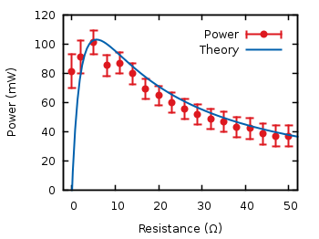
#!/usr/bin/gnuplot
# Plotting data about battery power (see battery.dat)

reset

# wxt
set terminal wxt size 350,262 enhanced font 'Verdana,10' persist

# color definitions
set border linewidth 1.5
set style line 1 lc rgb '#0060ad' lt 1 lw 2 # --- blue
set style line 2 lc rgb '#dd181f' lt 1 lw 2 pt 7 # --- red

set key at 50,112
set xlabel 'Resitance (Ω)'
set ylabel 'Power (mW)'
set tics scale 0.75

# Therotecial curve
P(x) = 1.53**2 * x/(5.67+x)**2 * 1000

plot [-2:52][0:120] 'battery.dat' u 1🙁$2*1000):($4*1000)
                        t 'Power' w yerrorbars ls 2,
                    P(x) t 'Theory' w lines ls 1

